My acquaintance with trading patterns began at the very beginning of a trader’s journey. I remember a colleague telling me what triangles were, which he was trying to trade at that time. He (as it turned out later simply by lucky circumstances) managed to earn money for an inexpensive car from Forex, so I listened. Over 7 years of trading with real money, I have made one single conclusion: patterns and figures work only in the skillful hands of an experienced speculator, and not on their own. Below I will tell you in detail what patterns are, how to use them and several other important nuances.
Reading Candlestick Charts
Before you can read candlestick patterns, you must learn to understand the structure of each individual candle. Each candle takes into account a certain period of time. It can be 1 minute, 60 minutes, day, week, etc. Regardless of the time period, the candle represents four different values on the chart:
- The opening price at the beginning of the time period.
- Closing price at the end of the period.
- Highest price over a period of time.
- Lowest price for a period of time.
As you can see in the picture, when you read a candle, depending on the opening and closing price, it provides you with information about whether the given time period was bullish or bearish. When the closing price is higher than the opening price, it is called a bullish candle. On the contrary, when the closing price is lower than the opening price, it is known as a bearish candle. And the upper and lower shadows represent the highest and lowest price for a given period of time.
Pros and cons of candlestick charts
Compared to line charts, a candlestick provides more data for analysis.
Although the same four values can be obtained from bar charts, bars use horizontal lines on the sides of a vertical line to project the opening and closing prices. But a series of candlesticks on a chart can help traders more accurately determine the pattern of price movement in the market, which helps in the decision-making process.
With candlesticks it is much easier to interpret price action over a period of time because a bullish candle shows a full body with a pre-assigned color, while a bearish candle shows a full body with a different pre-assigned color. As a result, many professional traders have switched to using candlestick charts because they easily interpret the simple visual appeal of candlesticks.
While candlestick charts make price movement much easier to interpret, they lack the smoothness of a line chart, especially when the market opens with a large gap. Therefore, sometimes professional traders use a moving average over a certain period of time to see the movement or lack of trend in the market.
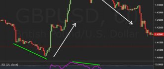
Scheme No. 20. Linear channel (rectangle)
- The Rectangle pattern refers to trend continuation patterns, with a 70% probability of completion, a reversal probability of 30%;
- the principles of formation and development are the same as in the description of Scheme No. 18 ;
In the descriptive material, we decided not to include examples of charts from the market, since each case is special, it is advisable that readers themselves open the exchanges or the portal tradingview.com, start looking for similar patterns and see how they worked out.
Community based content
Thank you for your attention. We will be very grateful for subscribing to our channel Mirai Notes |未来|
Subscribe to our Telegram
Candlestick patterns and their types
Over the years, Japanese traders have developed various candlestick patterns based on historical price movements. Every trader should invest their time and study these patterns as it will give a deeper knowledge and understanding of charts in general. Candlestick patterns can help you interpret price movements in the market and make predictions about the immediate directional price movement for a selected asset.
While there are many different patterns, we will discuss some of the most popular ones that will help you learn to read charts like a professional trader.
Reading candlesticks can give us information about three market sentiments: bullish, bearish or neutral.
Below are some patterns that can help us gauge market sentiment:
For example, a full-bodied bullish candlestick indicates a continuation of a bullish trend, while a full-bodied bearish candlestick indicates a continuation of a bearish trend. On the other hand, a Doji candlestick represents a neutral market condition.
When you see candlestick patterns, you must remember which candlestick patterns indicate bullishness, which indicate bearishness, and which indicate neutral market conditions.
If you read the chart and find a bullish candle, you may want to consider placing a buy order. On the other hand, if you find a bearish candle, you can place a sell order. However, if you find a candle like the Doji, it would be a good idea to stay out of the market.
One of the most important things to consider is the location of the candlestick formation. For example, a Tombstone Doji that appears at the top of an uptrend can indicate a trend reversal. However, if the same pattern appears during a prolonged downtrend, it does not necessarily mean a continuation of the bearish trend.
Once you have mastered simple candlestick patterns, you can move on to more complex ones such as bullish and bearish 3-candlestick formations.
The main difference between simple and complex candles is the number of candles required to form them. While a simple pattern such as a hammer requires one candle, more complex patterns usually require two or more candles to form.
For example, a bullish harami requires two candles, a Three White Soldiers pattern requires three, and a 3 inside up formation requires 4 candles.
Once again, remember that no matter the complexity, the placement of all these simple and complex candlestick patterns is one of the most important aspects of chart reading.
Summary
Candlestick reversal patterns are not a ready-made strategy, but only a market analysis tool. Its effectiveness depends only on how the trader uses it. Pros work almost on a clean chart, guided by patterns on higher timeframes. Beginners often try to take into account everything that even remotely resembles candlestick formations and get one stop after another.
If you want to get the most out of candlestick reversal patterns, integrate them into a trading system based on graphical analysis. These instruments fit together perfectly.
Sniper X is suitable for the role of such a TS. Candlestick patterns will complement entry points based on the chart’s reaction to levels.
Download the Sniper X basic course for free here
How to understand candlestick patterns?
All reversal patterns are essentially the same. Whenever any of them form in a trend, they signify a potential end to the current trend.
A bearish candle is formed when the bears have more power than the bulls. If the bears are stronger over a longer period of time, you will see a bearish trend.
Now imagine that in a downtrend a small candle with short shadows appears. This means that there is uncertainty in the market.
If you open a book or website that specializes in candlestick trading, you will likely find dozens of different candlestick patterns. In my opinion, you shouldn't try to remember them. It can even hurt your trading if you become fixated on finding individual candlestick patterns.
With the principles below, you will be able to interpret 90% of all price charts without having to memorize any artificial formations.
List of candle designs
Reversal patterns include:
- shooting star and inverted hammer;
- hammer and hanged man (hanged man);
- tombstone and dragonfly - a type of doji;
- 2 types of absorption;
- a gap in the clouds and a curtain of clouds;
- morning and evening star.
The colorful names are explained by the specifics of Japanese culture. Candlestick analysis originated in Japan, hence the unusual terms. But even if you don’t remember all the terminology, it’s enough to at least understand what happens in the market when reversal candlestick patterns form.
Maribozu
The Marubozu candle has no shadows at all. This is a strong trend continuation pattern that tells us that the bulls or bears are in complete control of the market.
Think of it in terms of a battle between bulls and bears. In the case of the bullish marubozu, when the candle opened, the bears were unable to push the price down one bit. She immediately went upstairs without any kickbacks. The opposite is true for bear maribozu. Since the bulls or bears have so much strength, it is logical to expect that they will have enough strength for the next candles and the trend will continue.
Top
The candlestick pattern indicates a fierce battle between bulls and bears. No one has won the battle yet, so the candle closes close to the opening price. Both bears and bulls tried to push the price in their direction, but they failed.
The body of the top can be either bullish or bearish - it doesn't matter too much. The important thing is that there are two shadows at both ends that are much larger than the body of the candle. The appearance of a spinning top pattern in a trend indicates uncertainty about further movement.
The spinning top pattern can often also indicate a possible completion and reversal of the current trend.
Morning and evening star
If a top appears during a bullish trend, it indicates uncertainty. Once a large bearish counter-trend candle appears, the bears finally win and the trend is likely to reverse. This formation is called the morning star or evening star.
Evening or morning star are most often used on daily charts, however they can be used on lower time frames.
Formation and sequence of candles:
- During an uptrend: long green candle – very small candle – large red candle.
- During a downtrend: long red candle – very small candle – large green candle.
The model enhances the appearance of the gap.
This is a classic reversal pattern. After a strong trend, volatility increases, but the price cannot continue its movement. The third candle confirms the trend change.
Pattern 1-2-3
The 1-2-3 pattern is a reversal formation and is quite often found on charts at the end of the main trend movement. During a bearish model, this model consists of a directional price movement ending with a peak, followed by a short-term decline, the formation of a minimum, again a short-term increase, a peak, but lower than the previous one, and a transition to a decline.
In a bullish pattern, the pattern is formed after a downward movement that ends with two lows, the second of which is higher than the previous one, after which the price begins to rise. In addition to trends, the 1-2-3 pattern is also found in flats.
A bearish pattern forming in an uptrend is called the “1-2-3 High Pattern” and indicates a transition from a rising market to a downward trend.
Similarly, a bullish pattern forming in a downtrend is called the “1-2-3 Low Pattern”, and is a signal of a reversal of the downtrend and the market transition to growth. Both pattern formations can be used to determine the end level of the correction.
That is, you can use it as a signal to enter the market in the direction of the dominant trend.
So, on the chart, the 1-2-3 pattern is formed by two impulses and a pullback, which are, in fact, two market waves that create three base points for constructing this pattern. Moreover, the more candles there are between the points, the greater the movement will follow after the formation of the figure is completed.
You can notice that a 1-2-3 pattern begins to form in the market when, after a strong directional movement, a countertrend movement forms in the market, creating point 1 and point 2 of the model on the chart. This impulse is the first element of the pattern. At point 2, a rollback towards the trend movement begins to form.
However, the impulse for this movement is not enough, and the price does not reach the previous extremum, and, having formed point 3 on the chart, proceeds to form a trend in the opposite direction.
How to trade when the 1-2-3 pattern appears
1. Wait until the figure is formed. All points 1,2 and 3 must be formed. 2. It is important that after the third point the price breaks through the level of point 2 on the chart. 3. If we are dealing with a 1-2-3 low pattern, place a pending order buy stop slightly above the level of breaking point 2. Stop loss at In this case, we set point 1 beyond the level, and after the price moves a little towards the open transaction, you can move the stop loss beyond point 2.
4. When trading the 1-2-3 high pattern, place a sell stop order slightly below the level of the second point, and move the stop loss above point 1. After the price moves some distance down after opening a trade, the stop loss can be moved above point 2.
5. The minimum potential for price movement after the 1-2-3 pattern is measured by the distance from point 1 to point 2, and by deferring this value from point 3 towards the movement that began after it. 6. If you have an aggressive trading style, you can open a deal after point 3, without waiting for the level of point 2 to be broken. However, this is risky, since after point 3 the price may go flat.
In this case, you need to enter the market after breaking through the trend line drawn through points 2 and 3. In this case, when the price approaches the level of point 2, you can either close the deal and fix the profit, or wait for further price movement in this direction. You can also partially fix the transaction, and move the stop loss for the remaining volume of the position to breakeven and wait for an increase in profit.
It is worth noting that the 1-2-3 pattern can be found on the market in combination with other technical analysis patterns. For example, in combination with the Three Indians pattern, it can form a head and shoulders reversal pattern.
In this case, the signals of the 1-2-3 pattern and the “head and shoulders” are superimposed, which strengthens the signal in the general direction. In this case, you can prepare to enter a trade from point 3 of the 1-2-3 pattern, anticipating the formation of the third shoulder, and without waiting for the neck level to be broken. In overbought and oversold zones, the 1-2-3 pharmacy is a stronger signal of the start of a correction.
Dependence of the pattern signal on the time frame
The strength of the signal and the duration of the trend emerging after it also depend on the time frame. The higher the timeframe the figure is formed, the stronger the signal.
For example, the formation of a pattern on the daily timeframe indicates the emergence of a directional movement that will last from two to eight weeks. If it is formed on a weekly basis, then the new trend can last from four to sixteen weeks.
The formation of a pattern on the monthly chart can be the beginning of a directional movement for a period of two to twelve months. If you notice this figure on lower timeframes, you can use its signal for intraday trading.
Doji
Dojis come in different shapes and sizes, but they are all characterized by the complete absence of a candle body. This means that the price closes in the same place where it opened. Of course, perfect dojis will appear quite rarely, so the body of the candle may simply be small.
Doji also speak of uncertainty and in this way they are similar to a top. Whenever you see a doji on your chart, it means there is a fierce battle going on between the bulls and bears. And in the end, neither side wins this battle.
Dojis indicate indecision and a possible reversal if they appear in a trend. For example, if a doji forms in a bullish trend, this tells us that the strength of the bulls is depleted and the bears are beginning to resist more and more.
The Doji candle has a very small body and long shadows on both sides. The shadows are usually the same size. Dojis often occur after strong trending movements or at previous support or resistance levels.
The Doji itself is not a signal and should not be traded separately. It is important to remember that the Doji is an uncertainty candle. After a long and strong rally, the Doji shows that the market has stopped and is now reassessing the market situation.
The size of the shadows can often reveal a lot about the dynamics of buyers and sellers. Long shadows indicate a strong fight between bulls and bears, while small shadows indicate inactive trading and calm in the market.
A gap in the clouds and a curtain of clouds
These reversal candlestick patterns are similar to engulfing patterns, the difference being that there is no requirement to engulf the first candle of the formation. Pattern characteristics:
- It is desirable that both candles be full-bodied with small shadows;
- a cloud cover forms at the peak of a rising market. The opening price of the second candle is higher than the Open price of the first, the body is black, and the Close price is between the Open and Close of the first candle. As a rule, on the 2nd candle a census of the maximum movement occurs;
- the mirror pattern is formed at the low of a downtrend. The formation rules are mirrored.
An example of a curtain of clouds, quite good work
This model is not absorption, but a gap in the clouds. Its formation coincided with a rebound from the support level
These reversal candlestick patterns are traded in the same way as engulfing patterns. Just keep in mind that the model is somewhat weaker than engulfing, so pay more attention to confirming the signal about an impending market reversal.
Cloud curtain model and market entry options
In addition to trend changes, formations of this type often appear at the end of corrections. So, when approaching the chart to the corrective Fibo levels of 38.2%, 50.0%, 61.8%, be careful.
Hammer and Hanged Man
The Hammer and Hanging Man candlestick patterns look exactly the same, but have completely different meanings depending on where they appear on the chart. They both have small bodies (black or white), long lower shadows and short or no upper shadows.
A hammer is a bullish reversal pattern that forms during a downtrend. It's called that because the market hits bottom and hits it like a hammer.
A long lower shadow indicates that sellers pushed the price lower, but buyers were able to overcome the selling pressure and the price closed close to the open.
Just because you see a hammer appear in a downtrend does not mean you need to enter a buy position. A more reliable indicator of a trend reversal would be the appearance of a bullish candle after the hammer.
Hammer Criteria:
- The length of the shadow is approximately two to three times the length of the candle body.
- The upper shadow is practically absent.
- The body of the hammer is within the range of the previous candle.
- The color of the candle is not important.
Hanging Man is a bearish reversal pattern that indicates a strong resistance level.
When the price rises, the appearance of a hanging man indicates that selling pressure is beginning to intensify and the direction of the current trend may change.
The criteria for the hanged man are the same as for the hammer.
Trend reversal pattern indicator – Candlestick Patterns
To automate the search for patterns on the chart, special indicators were created. One of them is CandleStick Patterns. He can search for patterns from different categories, including reversals. In this case, the tool can be configured so that it searches for figures only from one group, for example, strong reversal setups.
The tool has a sound notification function. When the desired pattern appears, CPI emits a characteristic sound signal and draws an arrow on the chart that indicates the direction of the transaction. It is also very convenient that the indicator signs all found patterns.
To search for strong reversal patterns, you need to activate the “Show Strong Reversal Patterns” function. They will indicate a change in trend. If you activate the “Show Continuation Patterns” function, the tool will also look for weak reversal patterns. True, their signal will definitely need to be confirmed by other indicators.
The tool is suitable for any currency pairs. CPI gives two types of signals:
- There is a green arrow to buy.
- For sale - red arrow.
The name of the found setup is indicated next to the arrow.
Candlestick trend reversal patterns can be used in different trading strategies. They are usually used as an addition to the system, filtering signals from other indicators. We recommend that you familiarize yourself with several effective Price Action strategies that we wrote about earlier.
Inverted Hammer and Shooting Star
The inverted hammer and shooting star candlestick patterns also look similar. The only difference between them is whether they appear in a downtrend or an uptrend.
An inverted hammer signals a bullish reversal.
A shooting star signals a bearish reversal.
Both patterns have small bodies, long upper shadows, and little or no lower shadows.
An inverted hammer occurs after a price drop and indicates the possibility of a trend reversal. Its long upper shadow shows that at first buyers pushed the price up, but then the initiative passed to sellers. However, buyers were then able to reverse the trend by closing the candle slightly above the opening level.
Since sellers were unable to push the price lower, this is a good sign that everyone who already wanted to sell has already sold, and there are no more sellers left. And if there are no more sellers, then who will remain? Buyers.
A shooting star is a bearish reversal pattern that looks identical to an inverted hammer, but occurs after an uptrend. It means that buyers tried to push the price up, but sellers came and overpowered them. With no more buyers left, the price is likely to reverse.
What is a “pattern” in trading?
Translated from English, a pattern is a pattern or model. At least if we talk about this concept from the point of view of stock trading. At its core, a pattern is a repeating combination of various indicators, volumes, prices, and so on. Simply put, this is a certain situation that is repeated from time to time and thereby allows you to predict the future movement of the chart. And such a forecast, as you might guess, helps the trader make money.
The system is based on a fairly simple axiom - everything repeats itself. Almost any situation will repeat itself sooner or later, and the trader’s task is to find out exactly when the desired data arrangement on the chart will occur.
Let's give an example, let's say that a certain asset, immediately after the start of trading, always first seriously declines in price and only then begins a gradual increase. Statistics show us that this trend has been continuing for a long time. At the same time, there is no news regarding the asset. This means that we can assume that exactly the way it works now will continue to happen.
As a result, we get at least two entry points: at the start of trading, we immediately open a contract for a fall and, then, when the trend turns towards growth again, we open another one – for an increase. There can be a lot of similar situations and each of them can be simulated and tested using various tools.
Some indicators, such as Bollinger Bands, work precisely on the basis of such patterns. In this example, it is recommended to open a contract when the chart goes beyond the upper or lower Bollinger band. That is, an analogy has been drawn that in the overwhelming majority of cases, it is after crossing such a band that the trend reversal begins.
Engulfing pattern or outside bar
The engulfing pattern signals a strong reversal and is formed with two candles. The second bullish candle completely engulfs the first bearish candle. This means that sellers have lost their initiative after the recent downtrend and the bulls are now in complete control.
On the other hand, bearish engulfing shows us the opposite picture. This pattern occurs when a bullish candle is immediately followed by a bearish candle and completely engulfs it. This means that sellers have overpowered buyers and there is now likely to be a big drop.
Absorption is a very powerful signal, especially if it occurs in the right place and context. This pattern is more significant if the first candle has small shadows and the second candle is much larger than the first.
During trends, you will often see engulfing patterns occur during pullbacks, so this pattern can be used to add to an existing trade or to find a new entry point.
Internal bar and fakes
The inside bar is the opposite of the engulfing pattern and is a small candle that is completely within the range of the previous one.
A fake occurs when, after an inside bar, the price breaks the high or low of the inside bar and then immediately reverses. Thus, fakes can be compared to a false breakout pattern or a trap for bulls or bears, where the price breaks out and then immediately reverses.
Waiting for the candle to appear after the inside bar is the key to trading this pattern. Most traders use pending orders to trade inside bars, which makes their stops very vulnerable. This is why you will often see a fake pattern after an inside bar.
An inside bar shows a temporary pause in trading activity on the market and most often occurs after long trends or at the beginning of a new trend. As a rule, the market maker accumulates or distributes positions on the inside bar.
Tweezers
The tweezer pattern usually occurs after a prolonged uptrend or downtrend and indicates an imminent reversal.
The most effective Tweezers pattern has the following characteristics:
- The first candle matches the current trend. If the price is moving up, then the first candle should be bullish. If the price is moving down, the first candle should be bearish.
- The second candle is opposite to the previous trend. If the price moves up, then the second candle should be bearish. If the price moves down, the second candle should be bullish.
- The shadows of the candles should be the same length.
Pattern categories
Patterns are divided into the following categories: “Signal” and “Background patterns”
Signal patterns.
Signal patterns are used when opening a trade. Having assessed the situation against the background and done a market analysis. The trader is waiting for a signal.
Signal – indicates the weakness of one side and the strength of the other side at a moment in time. The signal can be Japanese candles with large tails, or some patterns in volumes. Almost everything that indicates a “local reversal” will be understood by the trader as a market signal.
The signal pattern allows the trader to enter with a minimum stop order. However, the trader will enter in the background.
Advice! I recommend reading the article “Market signal - market background” to understand the issues of background and signal.
Background patterns.
Background patterns involve analyzing larger patterns. Such as double top, double bottom, head and shoulders. Both graphical and volumetric analysis works with background patterns.
How traders trade background and signal patterns.
Patterns from two categories at once can be applied in the situation depicted here.
Signal and background patterns
The market is going up and has drawn a double top. After it starts moving down, you need to wait for the signal pattern. Be it a Japanese candlestick, a surge in volume, or some of your own signal patterns. Together, these two methods will give the trader the best possible moments to enter the market.
Three Soldiers and Three Crows
The three soldiers pattern occurs when three bullish candles follow a downtrend, signaling a reversal. The three crows pattern is the opposite of the three soldiers. It is formed when three bearish candles follow an uptrend, indicating that the trend is likely to reverse.
Three soldiers is a strong reversal signal, especially when it occurs after an extended downtrend.
The first candle of three soldiers is called a reversal candle. It stops the downward trend.
For the pattern to be considered valid, the second candle must be larger in size than the reversal candle. Additionally, the second candle should close near its high, leaving a slight shadow.
In order for the three soldiers pattern to fully form, the last candle must be at least the same size as the second candle and be without or have a small shadow.
The opposite applies to the Three Crows pattern.
Three inside up and three inside down
Three Inside Up is a trend reversal candlestick pattern that shows that a downtrend may have ended and a new uptrend is beginning.
Here are his criteria:
- The size of the first candle should be larger than the bearish one.
- The second candle must be within the range of the first candle.
- The third candle must close above the high of the first candle to confirm that buyers have completely overcome the strength of the downtrend.
The opposite is true for a three-in-down pattern that forms at the end of an uptrend.
Scheme No. 12. Head and Shoulders (H&S)
- The Head and Shoulders pattern refers to trend reversal patterns, with a 90% probability of completion;
- the neckline should be horizontal or inclined towards the upcoming trend reversal - this is how the figure is considered more workable;
- trading volume falls as the pattern forms and increases sharply upon its breakdown;
- classic entry occurs on a breakdown of the neck line or on its retest;
- practicing the figure after breaking through to the height of the head from the neck line;
- in most cases there is a strong impulse at the breakout
How to understand charts and candlestick patterns?
By now you should have a good idea of how to read simple and complex patterns. Let's now try reading the charts to see how we can trade using the patterns we've learned.
In this example, we see that the price bounced off a strong support level but failed to break below it. On the third attempt, the price actually broke through the support level, but the market quickly turned around and formed an Absorption pattern, which signaled a further rise in price.
At this point, some novice traders may recognize the bullish sentiment and immediately open a buy order. However, professional traders will not only wait for candlestick patterns to form around key turning points such as this support level, they will also wait for confirmation to enter a trade.
The next day, the price broke above the high of the engulfing bullish candle, confirming that the market would be bullish over the next few days.
Professional traders wait for this confirmation because they understand the concept of order flow and believe in the self-fulfilling prophecy.
Most large banks and hedge funds also watch key market levels and price movements at critical levels. Once a bullish candle formed near a critical support level, it triggered a significant number of pending buy orders just above the high of that bullish candle. Once the price penetrated above the high, it triggered these orders, which added further bullish momentum to the market.
As you can see, once the buy order confirmation came in, it caused a big uptrend over the next few days.
When you apply candlestick patterns with additional technical analysis factors, it provides a powerful combination of conditions for profit. This is exactly what professional traders try to do.
If the same Engulfing pattern appeared at the top of a long-standing uptrend, it would also signal an additional bullish move in the market, but the signal would be much less strong. Since the market was already in an uptrend, it may not have had enough momentum to push the price much higher.
However, in this case, the market had already been trading in a range for several days. As you may know, when a market has been consolidating for a while, it is generally set up to break out in one direction or another.
We see two different candlestick patterns triggering two different trades. For the first time, the Engulfing pattern appears during a downtrend and gives traders a signal to continue the trend. In the second case, the Three White Soldiers pattern appears at the bottom of a downtrend, causing a new bullish trend.
In the first trade, the price is already moving down. Once the bearish candle broke below the support level, it opened up the possibility of a continuation of the trend. The next day, price penetrated below the low of the engulfing bearish candle and confirmed the trade, which initiated a sell order.
This example demonstrates that if you know how to use confluence of support and resistance levels along with candlestick patterns, it can be used to trigger trend continuation signals.
In the second trade, the Three White Soldiers pattern appeared at the bottom of this downtrend. The prudent move would be to wait for the market to confirm this signal, meaning that if price had not broken above the high of this Three White Soldiers Candlestick pattern, you would not have entered the trade.
Trading
Figures and patterns in trading | A selection of the best Price Action patterns
sova
|
6-03-2020, 01:40 | Good day, dear readers!
In this article, I decided to make a selection that includes the maximum number of Price Action figures and patterns. All examples in the article are taken from intraday time frames of futures for Sberbank and Gazprom shares. Some examples show my actual trades. The strength of Price Action (translated as “Price Movement”) is that it is a trading method that quickly clears the price chart of “garbage.” It is based on making money using market inefficiencies - various figures and patterns that can be found on the price chart. In addition to this method, many traders (including myself) use support/resistance levels and volumes. First, let's look at what figures and patterns in trading are. If you already know what it is, then feel free to scroll down. For those who don’t know yet, let’s find out.
The essence of the Price Action strategy is based on a simple opinion: If a certain event happened in the past, then with a high probability it will happen again in the future.
Definition
Figures and patterns in trading are periodically repeating combinations of price data. By the way, patterns can be not only price patterns, appearing on volumes and indicators. For example, the MACD Indicator abounds in many different patterns. And to analyze the patterns of emerging volumes, a special strategy called “VSA” is used.
In simple words
Figures and patterns - the price chart shows various figures from time to time. These figures are a reflection of the behavior of the crowd (traders and investors) or a trace left by the actions of a major player, or both at the same time. The ability to recognize these patterns makes it possible, with a certain degree of probability, to determine the further price movement and make money on it.
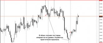
For your convenience, I have sorted all the figures and patterns presented in the article by effectiveness, based solely on my personal experience in using these patterns in trading.
Patterns marked in yellow
colors are ineffective and before using them you should measure seven times before opening a trade.
Patterns marked in orange
color have average effectiveness.
Patterns marked in purple
color are most effective. I actively use these patterns in my trading.
◻ Pattern Wedge
Type: Reversal pattern.
Chart: Candlestick, linear. Frequency of occurrence: often. Difficulty of working with the pattern: medium. Time frame: any. It is a price consolidation that forms between two converging trend lines. Occurs at the minimum or maximum of the current trend and signals a possible trend reversal. There are both bullish (occurs in a downtrend) and bearish (occurs in an uptrend) variation. For a trader, of interest is a wedge directed in the direction of the trend movement, signaling the possibility of an imminent trend change.
Point of entry
Breakout of one of the trend lines forming the pattern.
Stop loss
It is installed behind the level opposite to the breakdown.
Take profit
Horizontal support or resistance level.
From the author.
Personally, I use this pattern extremely rarely in combination with levels and volumes. Its main disadvantage is that it does not give accurate signals and is both a trend and counter-trend pattern.
◻ Flag Pattern
Type: Trendy.
Chart: Candlestick, linear. Frequency of occurrence: often. Difficulty of working with the pattern: medium. Time frame: any. The Flag trend pattern consists of two parts:
Flagpole
— trend movement up or down.
Flag
— price channel.
Thus, the Flagpole is an impulse, the Flag is a correction. After the end of the correction, the trend movement continues in the same direction.
Point of entry
Breakout of the channel border in the direction of the trend.
Stop loss
It is installed behind the channel border opposite the breakdown.
Take profit
The height of the flagpole, the size of the impulse before the correction occurs, the horizontal price level.
It may seem that the Flag pattern is somewhat similar to the Wedge pattern - there are visual similarities between them, but the essence of the patterns is completely different. If the Wedge works “in both directions”, being both a trend and a reversal pattern, then the flag signals exclusively the continuation of the trend; as a rule, there are no other interpretations.
Also, the flag pattern can be either inclined or horizontal.
From the author.
This pattern works very well and will work for a long time - since it is based on the old market axiom that there are no recoilless trends, and the flag pattern is just one of the types of correction. However, I rarely use it in its pure form. Most often, I additionally focus on horizontal and vertical levels of support and resistance.
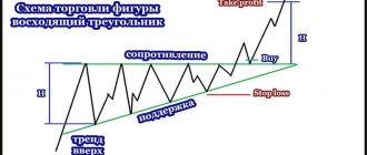
◻ Triangle pattern (pennant)
Type: Trendy. Chart: Candlestick, linear. Frequency of occurrence: average. Difficulty of working with the pattern: medium. Time frame: any.
This pattern is one of the variations of the Flag pattern.
This is also a trend pattern that usually appears as a field of a long, non-recoil impulse. The only difference from a flag is that towards the end of the formation of a corrective movement, its range narrows and takes on the shape of a triangle. Point of entry
Breakout of the channel boundaries in the direction of the trend.
Stop loss
It is installed behind the channel border opposite the breakout, behind the candles at the very beginning of the formation
Take profit
The height of the flagpole, the size of the impulse before the correction occurs, the nearest horizontal level.
From the author
From personal experience I will say that this pattern manifests itself many times worse than its “relative” flag. It’s difficult to say what this is connected with. But, the probability that the impulse will be along the trend is 50%. Also, in my not very successful attempts to work with this pattern, I noticed that the first impulses after the breakdown of consolidation can be false. Thus, the only advantage of this pattern I can highlight is that the impulses that arise after the breakout of the corridor are quite strong. And if you set a stop loss not using the standard method, as in the picture, but closer to the end of the triangle, then you can get a pretty good risk-reward ratio.
◻ Bowl Pattern (bowl with handle)
Type: Trendy.
Chart: Candlestick, linear. Incidence: low. Difficulty of working with the pattern: high. Time frame: any. This figure was discovered by trader William O'Neill. It is a trend continuation model. The appearance resembles a “Cup with a handle”, hence the name. At first glance, the pattern may seem extremely complex. But, in fact, the whole difficulty lies in correctly determining the level of support/resistance at the base of the figure. The formation of a pattern occurs as follows: After the formation of the next maximum in an upward or downward trend, a correction is formed in the form of an arc - the price smoothly decreases/increases and also smoothly returns to the extremum point. If it is not possible to break through the extremum, a second correction occurs, but of a smaller size. And if the previous correction formed the bowl, then the second correction is the formation of its handle.
Point of entry
Breakout of the support/resistance level after the end of the formation of the second correction (handle)
Stop loss
Set behind the level behind the maximum or minimum of the second correction (handle).
Take profit
The nearest horizontal support/resistance level or bowl height.
From the author
Some sources claim that the cup occurs exclusively in an uptrend. My experience says that this is a little different. This model can occur in a downtrend, as a pattern confirming a further price decline. At the same time, this pattern is so universal that it can be used as a reversal if it appears at the maximum of the trend in an inverted form.
◻ Pattern Diamond (Diamond)
Type: Reversible.
Chart: Candlestick, linear. Incidence: low. Difficulty of working with the pattern: high. Time frame: any. One of the oldest patterns of technical analysis. It is not often seen on charts, therefore, coupled with the relative complexity of interpretation, it is not particularly popular among traders. It represents a range of price movements that first expands and then narrows. Externally, the diamond figure resembles two triangles whose bases are connected. The reversal movement occurs at the moment of maximum narrowing of the range, at the second stage of pattern formation.
Point of entry
A breakdown of one of the “faces” of the figure at the final stage of the formation of the figure.
Stop loss
It is installed behind the tangent line opposite the breakdown.
Take profit
The nearest horizontal support/resistance level or maximum height of the pattern.
From the author
The most difficult pattern to detect, it can often be confused with a head and shoulders pattern; fortunately, both patterns are reversal.
◻ Tower pattern
Type: Reversible.
Chart: Candlestick Frequency of occurrence: low. Difficulty of working with the pattern: low. Time frame: any. This model is a series of candles (5-6) with small bodies. Occurring at the highs or lows of a trend movement, they signal the possibility of a change in the current trend to the opposite one, or at least the occurrence of a corrective movement. As a rule, before the appearance of a candlestick series, there is a strong short-term impulse in the direction of the trend.
Point of entry
The completion of the formation of the fifth candle with a small body.
Stop loss
Beyond the level of maximum trend values (if the trend is upward), or beyond the level of minimum trend values (if the trend is downward).
Take profit
The nearest horizontal support/resistance level or maximum height of the pattern. Also, the take can be set at a distance equal to the size of the last large candle, before the formation of the pattern itself begins.
From the author
The only thing I note is that if you trade futures, then you should look for this pattern on the chart of the underlying asset. Since futures have an additional evening session - liquidity and volatility are usually lower there, which entails the frequent appearance of a number of candles with small bodies on the futures chart, in this case this formation will not work, because its appearance is not caused by market factors, but technical.
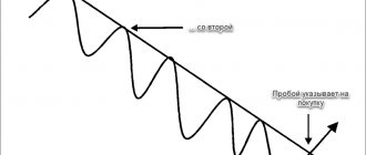
◻ Three falling peaks pattern
Type: Reversible.
Chart: Candlestick, linear. Frequency of occurrence: often. Difficulty of working with the pattern: low. Time frame: any. In an uptrend, 3 falling peaks are formed. At the same time, it does not matter whether the intermediate minimums decrease.
Point of entry
Breakout of the minimum price value within the model.
Stop loss
Beyond the nearest local resistance level.
Take profit
Set to the size of the distance between the first peak and the lowest minimum within the model.
From the author
If the entry point is near a historical or simply important support level, it is better to refuse to open a position. Also, if the trend is downward on a higher time frame, the signal strengthens.
◻ Pattern Three falling peaks according to the trend
As the trend moves, three peaks form.
—
In an uptrend, each new peak is higher than the previous one.
—
In a downtrend, each new peak is lower than the previous one.
◻ Three horizontal peaks pattern
Type: Reversible.
Chart: Candlestick, linear. Frequency of occurrence: average. Difficulty of working with the pattern: low. Time frame: any. The model is extremely easy to find - three touches of the price chart to the support or resistance level. When the chart touches the horizontal level for the third time, a trade is opened in the counter trend. To find the third touch, it is necessary to apply a horizontal level initially at two points. Then wait until the price, having approached this level for the third time, touches it and begins to correct slightly. If this happens - the price touched the level and began to move in the opposite direction, you can try to enter a position.
Point of entry
The beginning of the correction after a collision with the level.
Stop loss
Beyond the horizontal level
Take profit
The nearest significant horizontal support/resistance level.
From the author
I often use this model in my trading. Its huge advantage is the ability to set a small stop loss, with good, in many cases, profit potential from the transaction.
◻ Pattern Exit from consolidation.
Type: Universal.
Chart: Candlestick, linear. Frequency of occurrence: average. Difficulty of working with the pattern: medium. Time frame: any. The pattern most often occurs after long-term or short-term trend movements, at moments when equilibrium is established between supply and demand. During the formation of a sideways trend, the price consolidates, then a breakdown of one of the channel boundaries occurs, and as a rule, after the breakdown, a sharp jump in price occurs in the direction of the breakdown. Also, after breaking through the channel border, the price may return to retest the broken level, and only after that begin the main movement.
Point of entry
Breakout of the channel border, retest of the level after the breakout.
Stop loss
Inside the channel, beyond the boundary of the broken horizontal level.
Take profit
The nearest significant horizontal support/resistance level, the height of the price channel (pattern size).
From the author
In the diagram, working with this pattern seems quite simple and understandable. But in practice everything is much more complicated. As a rule, both channel boundaries have a lot of small false breakouts, which are easy to mistake for an entry point. Therefore, for a novice trader, it is best to use exclusively the second entry method - at the time of retest.
◻ Pattern Exit from consolidation with a false breakout.
Type: Universal.
Chart: Candlestick, linear. Frequency of occurrence: average. Difficulty of working with the pattern: high. Time frame: any. This model is a little more complicated than the previous one, but at the same time, it shows itself to be much more effective. The pattern formation scheme is exactly the same: the price consolidates, forming a horizontal channel, but at one of the stages of formation (at the beginning, middle, or end) the price chart goes beyond the boundaries of the channel and almost immediately returns back, forming the so-called “False Breakout”. After which a real breakdown of the opposite border of the corridor occurs (immediately or after a while).
Point of entry
Breakout of the channel border, retest of the level after the breakout.
Stop loss
Inside the channel, beyond the boundary of the broken horizontal level.
Take profit
The nearest significant horizontal support/resistance level.
From the author
I myself rarely trade this model - it’s not my thing. But, at the moments when I see it in a beautiful, understandable form on the chart, I can try to log in. As far as I know, this price behavior, a false breakout, and then going in the opposite direction, is interpreted by traders as “disembarking passengers” - the removal of stops by a major player before the start of a trend. In principle, this idea has every right to exist, although I hold slightly different views. Also, if memory serves, this model is traded by MyTrade.
◻ Double Bottom Figure
Type: Reversible.
Chart: Candlestick, linear. Frequency of occurrence: often. Difficulty of working with the pattern: low. Time frame: any. A double bottom represents two local price lows formed at the same horizontal support level. One of the oldest, but at the same time, effective figures of classical technical analysis. It has a mirror version of the “Double Top” - two local price highs that abut one resistance level. The trade is entered at the moment the neckline is broken through, or when it is retested.
Point of entry
Breakout of the neck line, retest of the neck level after the breakout.
Stop loss
Behind the peaks forming the figure.
Take profit
The nearest significant horizontal support/resistance level, figure size.
From the author
I use this model in my trading quite often, and on a variety of timeframes. It’s good if the bottom of the figure coincides, some global support level or pin bars form on the “bottoms” of the figure.
◻ Head and Shoulders Figure
Type: Reversible.
Chart: Candlestick, linear. Frequency of occurrence: average. Difficulty of working with the pattern: medium. Time frame: any. “Head and Shoulders” is not inferior in popularity to the above-mentioned “Double Bottom” figure. Which in principle is not surprising - it was this figure that the market turned around during the rush of demand for tulip bulbs in the Netherlands (1636-1637), and now it can even be found on the minute timeframe of the Sberbank futures.
The figure appears at the maximum of an uptrend. Consists of 3 consecutive peaks:
1. Right peak - First shoulder 2. Middle peak - Head 3. Left peak - Second shoulder
Each of the peaks rests on a support level called the “Neck Line”. You should open a downward trade at the moment the price chart breaks through a given level, or after the breakout at the time of retest. The model has an inverse version that occurs at the low of a downtrend - “Inverted Head and Shoulders”.
Point of entry
Breakout of the neck line, retest of the neck level after the breakout.
Stop loss
Behind the second (left) shoulder.
Take profit
The nearest significant horizontal support/resistance level, figure size.
From the author
In my opinion, this is one of the most interesting figures in technical analysis. Some traders believe that the figure is outdated and not effective. In my opinion, the figure is still quite effective, but in current times it requires a non-standard approach to the implementation of its signals.
◻Candlestick Pattern Pin Bar
Type: Reversible.
Chart: Candlestick. Frequency of occurrence: often. Difficulty of working with the pattern: easy. Time frame: any. It is one of the strongest reversal candlestick patterns. It is a candle with a large shadow and a small body. Occurring at the maximum of the current trend (the shadow of the candle should be directed towards the trend) symbolizes an active struggle between traders working for the fall (bears) and traders working for the increase (bulls) during which one of the parties wins a clear victory, which can cause a correction movement or change in the current trend. This pattern can also be a confirmatory (turn) pattern. In this case, the shadow of the candle should be directed in the opposite direction to the trend movement.
The pattern has the following features:
— Large shadow on one side. A strong Pin Bar has a shadow that is at least 5 times larger than its body. - Small body. The closing price of the candle is very close to the opening price. - Absence of body. The closing price of the candle coincides with the opening price.
Point of entry
The end of the formation of a Pin bar, the end of the formation of the candle following the pin bar.
Stop loss
Behind the shadow or behind the body of the candle.
Take profit
The nearest significant horizontal support/resistance level.
From the author
A good pattern, one of my trades for this pattern is presented here. Based on my personal experience, I can say that trading a pin bar in its pure form is only worthwhile in special cases. In all other cases, it is advisable to combine it with at least indicators, and better yet, with horizontal and vertical price levels or analysis figures, as I do.
◻ Candlestick Patterns “Bullish and Bearish Engulfing”
Type: Reversible.
Chart: Candlestick. Frequency of occurrence: often. Difficulty of working with the pattern: easy. Time frame: any. Bullish and bearish engulfing are candlestick reversal patterns.
Bullish Engulfing
— formed on a downward trend.
This is a situation when, after a falling
a growing one
appears , which is at least twice its size.
Bearish engulfing
— occurs during an uptrend.
This is a situation when, after a rising
a falling candle
appears , which is at least twice its size.
Thus, engulfing is a situation when the body of the subsequent candle covers the body of the previous one. This applies only to candle bodies. If the first candle has shadows, covering them is not necessary, but in general it is advisable.
An interesting point is that if you look at the “Absorption” by moving to a higher time frame, you will see a Pin Bar pattern in its place.
Point of entry
At the moment of completion of the formation of the “absorbing candle”.
Stop loss
Behind the shadow, or behind the body of the “absorbing” candle.
Take profit
The nearest significant horizontal support/resistance level.
From the author
One of the advantages of this pattern is the opportunity to enter a trade at the initial stage of trend formation, and take a strong movement to get a good profit with little risk. “Absorption” shows maximum effectiveness when it occurs during a long recoilless movement.
Recommended trading patterns for the MACD indicator
That's all! If you have any questions, write in the comments, I will be happy to answer.