What's happened stock book prices and how to read the order book? This question is considered very popular among new traders. Exchange glass is a table with information about current orders to buy or sell a financial instrument. The glass indicator reflects the sentiment of buyers and sellers and is used in both trading and investing. The market glass is called differently by participants in the trading process - order book, order book, trading book, market depth or level 2 in the American style. In this article we will look at all the features of using and reading the order book.
There are plenty of indicators on the Internet that offer to predict the future, how the price will move and what to expect in the near future. Accordingly, this is of interest to any trader. For some reason, there is less information about the order book , and it is not as popularized. There is logic in this, since the order book is inherent in traditional markets, and technical analysis is popularized by Forex companies, but in Forex there is no order book, because the order book is a table that indicates the list of limit orders at the current moment. Forex is an over-the-counter market, and there cannot be information about all orders. Even if it is present, it is not a reflection of real affairs on the global over-the-counter market.
This is the danger of Forex trading. After all, there is no objective information about what applications are present on the market, what prices are.
What is technical analysis and why is it needed?
Technical analysis of the stock market is the study of the dynamics of stock prices. The method allows you to identify patterns, apply this knowledge, enter positions accurately and, accordingly, earn more. It is generally accepted that technical analysis is a purely visual perception of charts.
But in fact, it includes an analysis of volumes, transactions, current orders and, in general, any technical information about exchange trading that stock market participants are able to obtain.
Brief history of appearance
Technical analysis of stock markets is not a new story: it has been used for a very long time. Back in the 17th century, Joseph de la Vega used it to forecast the Dutch stock market, and in Japan, rice prices were analyzed using the same principles.
However, in the form in which it exists now, technical analysis appeared at the end of the 19th century thanks to Charles Dow and Edward Jones.
Now, with the advent of computer technology, methods for analyzing the prices of stock instruments are constantly being improved, but the basic principles remain the same.
What does TA study?
Using graphic patterns, trading volumes, participant activity and other points, a technical analyst tries to identify stable trends, find levels of real resistance and support, as well as possible reversal points of market trends.
Does technical analysis work or not?
The unconditional relevance of technical analysis is in question. But I would say this: different technical analysis works for different periods. You need to understand that fundamental conditions still prevail in stock markets, but technical factors help to find a better point for forming positions.
I would not recommend relying solely on the technical method of studying market prices, and this is confirmed by statistics, with which technical analysis is closely related. But there are other established opinions on this matter, which I will talk about later.
Three types of market capacity
- Potential capacity. This is the market size that implies maximum demand for your product among all consumers. That is, a situation in which any member of the target audience is ready to constantly buy your product.
- Factual. This is an indicator based on the current development of demand. For example, all the people who currently use goods and services of your particular consumer segment.
- Available capacity. This is the number of consumers that your company can claim with its existing product and its characteristics.
For example, you organized a taxi service and calculate the capacity in physical terms, that is, in the number of consumers.
The potential capacity of your market is clients of taxi or car sharing services, motorists who are tired of driving themselves, people who use public transport.
The actual capacity is people who already use taxis; they do not need to be lured from other markets and industries.
Available capacity is the target audience for your specific product. For example, if you have economy class, then these are people who want to get to their desired location quickly and inexpensively. The audience that uses business class will not be included in the available capacity.
Why is it so popular among traders?
Techniques of technical analysis are universal; they can be used not only on the Russian stock market, but also to analyze Chinese stocks, or futures for orange juice concentrate, or anything else. The ease of use is captivating: even if a trader works with complex technical indicators, they are all built into the trading software and are absolutely easy to use.
In addition, today there is a huge amount of advertising, which is fueled by phenomenal success stories of traders using technical analysis.
Advantages and disadvantages
Indeed, one of the advantages of technical analysis is its universality of application for different markets - both Russian and any other. Another plus is that the principles of operation are the same for different timeframes, i.e. it doesn't matter whether you're looking at 5-minute charts or analyzing weekly stock market data.
Disadvantages include a high degree of subjectivity and the lack of real asset valuation factors. Investment champion and stock market guru Warren Buffett summed up the problems of technical analysis very well with the following phrase:
“I realized technical analysis wasn’t working when I flipped the chart over and it showed the same technical analysis.”
What you need to decide before you start making payments
Before calculating capacity, you need to prepare and decide what exactly you will calculate. The universal list includes the following criteria:
- Time. For what period should the capacity be calculated? It is better to take small periods of time, six months or a year, and even less for seasonal businesses.
- Geography. For which region will the market share be calculated? For example, you can calculate data for the entire country or only for a specific region or city.
- Audience. Who exactly is taken into account? Relevant for calculating the available capacity: the more the target audience is specified, the more accurate the indicator will be.
- Unit of measurement. For example, if you are going to sell a product at about the same price as competitors, it is easier to check how much money is in the market. If you have the opportunity to reduce the cost of a product or there are large price fluctuations in the market, it is better to check the quantitative indicator.
Basic principles of TA
There are three main principles that are taken into account when analyzing changes in market quotes in the stock market. The first speaks about market efficiency, the second about the trend direction of prices, and the third about the fact that patterns are bound to repeat themselves. Now about each in more detail.
The price takes everything into account
The meaning of this theory is that all information entering the stock market is instantly taken into account in the value of the asset. Therefore, it makes no sense to predict it relative to news flows: you need to abstract from fundamental conditions and focus on the past dynamics of market prices.
Prices move by trends
The idea here is that stock markets move exclusively within trend movements. Moreover, if a trader sees a growing trend on the weekly chart, it means that it will prevail over the one that appeared on the daily or hourly timeframe.
History always repeats itself
Stock market participants are always subject to the same emotional aspects, fear and greed. Therefore, the patterns that were identified in past periods should be repeated in the future, forming certain cycles.
What is a stock order book?
The order book in stock trading displays only limit orders with a set price, but the execution of which is not guaranteed. Where can I look at the stock order book ? The glass can be seen in the KVIC terminal, or in the broker's application.
The market order book is a list of all the most current prices, which are arranged in descending order, from highest to lowest.
The glass is divided into two parts:
- red prices are the prices of sellers; they are always located higher, since everyone is trying to sell at a higher price. This price is called ask - demand;
- green prices - a block of purchase orders, bids - from the English word offer.
The market price that is shown when you look at the issuer's card is the lowest selling price.
Technical and fundamental analysis: what are the differences?
Fundamental analysis focuses more on determining the fair intrinsic value of the underlying asset, and only then on comparing the resulting result with the market price. This method is more applicable to forming an opinion about the long-term prospects of a particular company on the stock market.
The technical method, on the other hand, is more speculative and uses market price as a baseline in its analysis. Then it tries to determine in which direction the quotes will move from a specific point.
Choose the BEST broker:
| Olymp Trade | |
| Deposit from 5$ | |
| Bet from 1$ | |
| FinaCom PLC | |
| There is a demo account | |
| START TRADE | |
| FULL REVIEW | |
| Binary | |
| Deposit from 5$ | |
| Bet from 2$ | |
| MFSA | |
| There is a demo account | |
| START TRADE | |
| FULL REVIEW | |
| FiNMAX | |
| Deposit from 100$ | |
| Bet from 5$ | |
| TsROFR | |
| There is a demo account | |
| START TRADE | |
| FULL REVIEW | |
Technical analysis methods (graphical and mathematical)
Methods for assessing market quotes can be divided depending on the object of study, for example, order book, volumes, analysis of classical patterns or candlestick iterations. To clear the mess out of my head, I’ll tell you about each specific method separately.
Classic technical analysis - graphical analysis
The method is based on the postulate of cyclicality of the stock market. To structure visual models, they began to be divided into price formations, or patterns. Each such formation in the stock market has its own formation rules. Of course, the amplitudes of price fluctuations are always different and do not repeat completely identically, however, the conditions for determining graphical models are quite clearly described.
The most common are “trading channels”, “head and shoulders”, “double top”, “flag”, “pennant”, “consolidation”, etc.
How to read Forex charts online in real time?
As mentioned above, candlesticks have the function of representing price action over a specific unit of time. Additionally, they can provide useful information such as market sentiment or possible trend changes through specific numbers. Understanding this is a great start to using trading candles.
When trading, especially Forex, you will analyze price charts to observe market movements. If we compare line charts and candlestick charts, you will see obvious differences.
A line chart is a very simple method to display price movement. It displays information on a single line using a series of dots. This is a chart that you might see in various magazines and newspapers that shows the market sentiment and the trend of an asset.
To understand candlestick charts, you need to know what price movement is, not as a line, but as a series of candles.
DAX Chart D1, MetaTrader 5 Admiral Markets Supreme Edition, accessed March 19, 2021.
Please note that all charts shown in this article are demonstrative and do not constitute a trading recommendation. Past performance is not a guarantee of future results.
Forex traders prefer Forex candlestick charts due to the fact that they show much more information than a line chart and can therefore be much more useful when making trading decisions.
Namely, if we display a candlestick chart for 30 minutes, each candle will take 30 minutes to form. Likewise, if the chart takes 15 minutes to draw, the candle will take 15 minutes to form.
Let's consider a specific case. If we take two charts showing the price dynamics for the EUR USD pair with a range of 1 hour. One with 15 minute candles and the other with 5 minute candles.
On the 15-minute chart, the hourly time frame produces 4 candles during this period.
On the 5-minute chart we will see 12 candles for the same timeframe. This way we can get more detailed information about what happened during that hour.
Thus, if two charts represent price action for the same asset, an hourly timeframe will show price action over a much longer period than a five-minute chart. But the latter will have more details.
To learn more about Japanese candlesticks, we recommend reading the following article.
Japanese candlestick analysis
When analyzing the stock market, Japanese candlesticks are most often used. The subject of study here is the formation of various combinations of two or more Japanese candles. When predicting stock market price movements, both simple combinations such as “absorption”, “Harami” or “morning star”, which are found very often, are used, as well as complex models that include many candles and confirmation conditions.
Their example is “fortress”, “bearish three-line breakout”, “ending bullish or bearish game with a gap”, etc.
Indicator analysis
As the name suggests, this analytical method involves the use of indicators. The indicators themselves are built on the basis of mathematical and statistical models. They can take into account volumes, duration of trends, weighted average trading indicators, the number and severity of transactions, as well as many other factors. All this is combined with each other, intertwined and built in the form of a certain visual model. Based on their properties, they can be divided into many groups, which I will also discuss separately.
Wave analysis of Elliott wave
This analysis of the technical picture of stock markets is named after Ralph Nelson Elliott, the founder of this field.
After analyzing a huge number of charts, he identified that market fluctuations almost always alternate, taking the form of waves. He divided these waves into correctional and driving. And then I found that most trends include a 5-wave model, where 3 are driving, and 2 are corrective.
Volume Analysis
Previously, this type of technical analysis, at least among participants in the Russian stock market, was avoided, but now it has received fairly wide recognition. Trading volume is the number of transactions completed over a certain period. In the classical form, trading volume is studied using the vertical method, i.e. transactions are analyzed relative to a point in time.
However, there is a cluster or horizontal method, when volumes are considered relative to price levels.
Glass
This type involves analytical work with the stock market book of quotes. The glass is an open auction where, on condition of anonymity, stock market participants offer to buy and sell individual instruments at specific prices. Traders try to track unusual orders during trading, based on this when deciding on a transaction.
However, in the stock market the order book does not always have sufficient information content, since many large orders are formed in the form of so-called icebergs or through special pools.
Market Trends
Beginners have the misconception that quotes move chaotically. However, in reality there are certain patterns. One of 3 trends always prevails:
- Upward – this trend is extremely easy to identify. New local extremes are noticeably higher than previous values.
- Descending – accordingly, extrema are formed under previous values.
- Sideways is not so much a trend as its absence, since quotes stand still.
Don't forget that the market trend is your best friend. Beginners are strictly prohibited from trading against the main movement. Determine the current trend and try to open positions in its direction. To correctly determine the market mood, analyze several charts at once with different time intervals.
Interesting material:
- 02/25/2019 Tricks of trading binary options For most novice traders, the task is to figure out the secret of successful trading. After all, knowing the secrets will allow you to increase the number of profitable transactions and reduce drawdowns. […]
- 11/25/2018 The options board of the Moscow Exchange and its use in trading The options board presented on the Moscow Exchange website is a table. Includes information about currently relevant contracts for a particular asset. On the board you can find [...]
- 12/02/2018 Review of the Quik program: functionality, additional settings The trading platform is a working field where the investor spends more time. Brokerage companies offer investors to earn money through their own terminals, or download […]
- 03/01/2019 Books for trading binary options: 7 best textbooks for beginners Initially, before you start trading on the financial market, you need to study the features of its functioning. Accordingly, time should be devoted to the basics of trading, the nuances of various [...]
- 01/04/2019 How to correctly set up the Stochastic indicator A wide range of technical tools are presented to investors for their work. There is a so-called group of classic, or frequently used indicators. The speech in this [...]
Trends and their types
A trend is a stable direction in which market prices move. There can be a varying number of trends in a stock chart, but the prevailing pattern of movement will be the trend. It can be of two types: bearish (downward) or bullish (upward). If the preferred direction is not established, then the market does not have a trend, but is in stagnation or consolidation.
Wave-like trends
If we talk about the principles of the formation of Elliott waves, then right now. Trends in stock markets do not develop like lightning; they move accompanied by constant corrective movements, and these can be both micro-movements and serious pullbacks. If the wave-like pattern is broken, then technical analysts talk about a possible trend change.
Trend duration
Technical analysis of stock markets in accordance with the theories of Charles Dow divides trends into short-, medium- and long-term. To fall into the first category and still be considered a trend, it is enough to last a few weeks. The second group includes directed movements from a month to six months; long-term movements are those that exist on the stock market for more than 6 months.
Trend lines
Trend lines are one of the simplest technical tools. Essentially, this is a straight line that runs through the lower points of local minima during an upward movement and through the upper points of local maxima during a bearish trend.
Channels
This is one modification of the use of trend lines. To outline the channel, it is necessary to add the same parallel line to the main trend band, but on the other side of the price range. This limits the levels of possible volatility and provides insight into the trading channel.
What is market capacity
This is an indicator that approximately reflects the market's ability to consume some product.
Usually the term is narrowed down, the market capacity in a specific area is calculated - for example, they look at what demand exists in the tourism market within specifically designated geographic boundaries.
Simply put, market capacity is a measure that tells you approximately how much of a product consumers in a particular market can buy. By market we mean some abstract place or industry - for example, it could be a wide market for IT services in a country or a narrow market for hairdressing salons in one city.
Measure capacity:
- in quantity or volume of goods that can be sold;
- in the amount of money that can be earned.
Support and resistance
Technical support and resistance in the stock market can be recognized as local extremes or any other points or price ranges in which there was selling pressure or an increase in the desire of buyers to purchase an instrument.
The magic of round numbers
These are certain psychological levels that are very quickly evident. For example, a level of 100 or 200 rubles. a promotion will always attract the attention of more traders than the price of 34 or 67 rubles. It has been statistically proven that trading volumes increase greatly at such points. However, whether buying or selling will prevail is a closed question, because each participant in the stock market pursues his own goals.
Role reversal
Breaking through one of the technically important levels, as a rule, changes the role of this level to the opposite. Suppose there was a circular resistance of 100 rubles on the chart. per share, which protected bearish positions. After it passes, it becomes a support that will stand on the side of the bulls. The same applies to trend lines.
Channel of support and resistance
This is the range of price volatility, which is limited by support and resistance lines. Many traders often build their strategy precisely within such technical channels, buying from its lower limits and fixing near the upper limits.
Linear
The most primitive type of price display. A regular straight line is drawn connecting the points of the selected asset in sequence. Prices can be used as initial information:
- discoveries
- closing
- minimum
- maximum
It can hardly provide the player with any significant information for decision-making, being only a visual display of digital indicators. Below is a typical line chart.
Volumes
Trading volumes in the stock market are the number of lots of shares that were traded over a specific period of time. Volume analysis helps determine how important certain technical analysis formations formed during trading sessions are.
How to read volumes in Tradingview
As a rule, volumes are placed at the bottom of the charts. They represent a histogram, each column of which corresponds to a separate time period. Those. If you select a 5-minute chart timeframe, the volume indicator will take into account the number of shares or lots for each reporting 5 minutes of time. The size of the bars varies depending on the size of the transactions: the larger the volume, the higher the bar. If the volume scale is located on the vertical part of the chart, the same principle can be used to analyze volumes relative to the price levels of stock instruments.
Other volume sources
For technical analysis of volumes in the stock market, you can use alternative methods of obtaining information, for example, a deal feed. It makes it possible to see all transaction flows and isolate interesting points from the overall picture. This also includes volumetric indicators, such as volume oscillators, etc.
Divergence by volume
Divergence is the discrepancy between the dynamics of volumes and quotes. To understand what this is, you can imagine a simple situation when the price updates its maximum, but the volume indicator does not, i.e. the new extreme is established by smaller volumes than the previous one. This means that the peak of the trend has already been passed earlier, and with each further movement the turning point becomes more likely.
Volumes and figures
The relationship between volumes and graphic formations is quite simply characterized. Volumes partially confirm the validity of the patterns. If a technical figure is formed on a significantly increased volume, then the significance of such a formation will be higher than that of one that was not accompanied by an increase in volume.
What is a spread, Bid and Ask prices?
It doesn’t matter whether a person is simply going to buy or sell currency for himself or is going to make money on the stock exchange through speculative operations, he will have to face two prices: Ask - the purchase price and Bid - the sale. The first one is always a little larger than the second one. The difference between them is called the spread and it is this that makes it possible for the exchange to exist, which makes a profit in the form of a spread charged to trading participants. That is, the exchange, like a regular exchange office or bank, sells currency to bidders at a higher price and buys it at a lower price.
In the image above, the red horizontal line represents the Ask price, while the black line below represents the Bid price. As we can see, the difference between them is the last 3 decimal places or 3 points. On the left side of the terminal, the image shows stock quotes for various currency pairs that are available for trading.
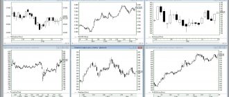
Types of charts
There are several generally accepted types of visual perception of exchange prices of stock instruments. Among them, the main ones are candlestick, line, and bar charts. Traders can easily access any of the presented types, but candlestick configurations are more often used. To complete the picture, I will talk about each of the ways to visualize prices on the stock market.
Candlestick chart
Japanese charts are a set of candles. Each of them shows the opening and closing price, as well as the minimum and maximum price for the reporting period. To indicate differences in the direction of price movement, the candles are painted in different colors. Most often, white for rising candles and black for falling ones.
Line graph
A line graph is familiar to most people. This is one line that sequentially connects the average points of movement of stock quotes on the stock market. This type of graph is considered the least informative, but it is more convenient for visually identifying general trends.
Bars
The technical essence of bar charts is identical in functionality to candlesticks, but is illustrated a little differently. Each bar reflects stock quotes for a certain period. It looks like a vertical line, on the left is a mural that tells you what the opening price was, and on the right is the closing price. The bar size is the price range for the time interval.
Where to find quote charts
Real-time quote charts are presented on leading information portals for traders and investors. Among them are sites such as:
- tradingview.com;
- investing.com;
- ru/indicators;
- ru/quotes;
- bcs-express.ru/kotirovki-i-grafiki;
The most convenient service I use is Tradingview.
In our case, the company chosen is Apple. But the service makes it possible to track almost any security and currency pair. If you are interested in what is happening on a particular exchange, then it is not difficult to find quote charts for the instruments traded on it on its official website. For example, you can study the Moscow Exchange asset of interest at the link moex.com/ru/data/
Technical analysis figures
Technical analysis of stock markets includes a huge number of different figures and formations. Now I will talk in detail about the main and most commonly used of them.
Head and shoulders
In technical analysis, it is believed that the appearance of this figure precedes a reversal of the market trend in the stock market. It looks like three peaks, of which the side ones (shoulders) are lower (or higher depending on the previous price direction) than the one located in the middle (head). A line drawn along local extrema is called a neck. It is the level, the penetration of which indicates a change in trend.
Cup figure
This is a trend figure in technical analysis. It can occur after a directed movement and visually resembles a cup with a handle. It is important that the price movement during the formation of this pattern is not sharp and that an arched base of the bowl is formed on the chart, after which a small correction occurs - a handle - and then a breakdown of the upper level and the price moves in the direction of the main trend. Like other patterns, this one can be used in mirror form.
Double top, regular and inverted
This is a reversal technical analysis tool. It is very easily represented and interpreted on a chart as two successive tops in the case of an upward movement or two bottoms in the case of a downward trend. After completion of the formation, it is assumed that the price will move in the opposite direction relative to the previous trend.
Triangle
Technical analysis figures such as triangles are found in stock markets with enviable regularity. In addition to the fact that they differ regarding the direction of the price, they also come in a symmetrical form. The nature of the movements is universal, i.e. depending on their type, they can indicate both a continuation of the trend and a reversal.
Symmetrical triangle
The figure is formed at the intersection of two trend lines, and the direction of the breakout indicates the further expected path of the price.
Descending triangle
A descending triangle is formed as the intersection of a resistance line and a trend line after a bearish trend.
Ascending Triangle
An ascending triangle can form after a bullish trend. Its illustration is the junction of the resistance line and the trend.
Flag figure
This technical pattern appears on the stock market after strong directional price movements: a narrow flat movement is formed towards a corrective rollback, the penetration of which will signal the continuation of the main trend.
Pennant figure
Another trending technical figure in the stock market. It is very similar in its structure and characteristics to the flag formation: it also appears after an impulse price movement, but at the moment of correction, the range of this figure begins to gradually narrow, and after breaking through the continuation of the main trend is expected. It works mirrored in both one and the other direction.
Wedge figure
Visually similar to the pennant and flag pattern, the wedge is a reversal technical analysis tool. On the chart, such a figure is presented in the form of a cone-shaped movement towards the main trend with a gradually decreasing volatility range. Exit from the range in the opposite direction to the trend indicates a change in trend.
Triple top or bottom
I already talked about the double top. In principle, the same case is here, but if the market after the second configuration has not increased its movement in the opposite direction to the trend, then you can wait for confirmation as the third top or bottom.
Saucer figure
This formation is very similar to the technical cup pattern, but it follows the trend, and this pattern, on the contrary, helps to determine the reversal point. You can notice this pattern when there is some kind of prevailing trend in the stock market, after which a smooth reversal begins, forming that same rounded saucer bottom on the chart. This configuration does not have clear signals of a trend change, which makes it somewhat difficult to work with. In practice, the pattern is quite rare.
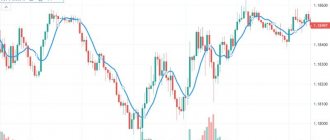
Moving averages
Moving averages, or moving averages, as they are also called, are the most common technical indicator used in the stock market. Essentially, these are averaged market quotes depending on the number of periods. Typically, they are displayed directly on top of the price chart as a line. With their help, they more accurately determine the general direction of the market trend, and also find specific entry points into the market.
Types of moving averages
Moving averages are divided depending on the chosen averaging coefficient, for example, they can be 15- or 200-day, or any arbitrary coefficient can be selected. They also differ in the intersection parameters, now available to traders: simple, exponential, smoothed, linearly weighted. In most cases, stock market participants use the first two types.
Using Moving Averages
If the technical averaging indicator is used alone, then, as a rule, it serves to visually determine trends in the stock market. But you can use moving averages to determine the reversal points of quotes, using averages with different time coefficients. To do this, two moving lines are created at once, one of which reflects a short averaging interval (15–50), and the second is adjusted over a long period (150–200).
A signal that the direction of price movement in the stock market will change will be the intersection of a fast moving average with a slower one.
Which moving averages to use
Each investor or trader selects these indicators for himself. It is important to understand how the calculation occurs: if a simple moving average with a period of 10 is selected, then the price at each point of the moving line is averaged over the last 10 candles or bars, in the subsequent period 1 candle is discarded from the calculation, the newly formed one is included, etc. Such an indicator loses its informative analysis during periods of market surges, since a regular moving average gives each candle the same conditions, regardless of how far it is from the overall market range.
Exponential moving averages can solve this problem, so when choosing a short period coefficient, it is better to use this type of moving average. The most commonly used periods are 12, 21, 150, 200 and 365.
Time intervals
You can analyze the movement of financial asset quotes on charts with different time intervals: minute, hour, day, week, month. The less experience you have in trading, the higher the timeframe you need to set. However, in binary trading, few people use charts with monthly or weekly intervals.
Of course, you can try your luck in trading on short-term TFs: M15, M30 or H1. It is still advisable to leave minute charts for later, since it is not for nothing that they are considered the most unpredictable. However, even if the analysis is carried out on lower intervals, the older ones must also not be forgotten.
Looking at the chart, we can conclude that the price is moving down, and this is the correct answer. The time interval of the chart is 30 minutes, and now we switch to D1.
Thus, a bear market is just a minor correction within the global bullish trend. If the investor had not switched to the daily chart during this period and bought a Put option, he would have lost his money in the final account.
Indicators
Technically, a stock market indicator is a mathematical algorithm that includes various statistical data about the progress of exchange trading in the stock market and displays this in a clear visual representation. Indicators are divided according to the goals and objects of study. Now I will talk about the most common and important of them.
Oscillatory indicators
Technical oscillators are indicators of market volatility whose conditions may change over time. One of the most popular indicators in the stock market is an indicator of this type called Rate of Change (ROC). It helps determine the speed of trend dynamics. Its main advantage is that it is in some ways a little ahead of the market. In a practical sense, this means that the maximum indicator level of the instrument will be reached earlier than a possible reversal of the market trend, and the trader will have time to take the correct position before the trend in the stock market changes.
Areas of increased risk of trend changes in such a technical indicator are usually called overbought and oversold.
There are other types of oscillators, such as stochastics, but I will talk about them separately.
Intersections and divergences
I already touched on the concept of divergence and moving average crossovers a little earlier. In order to more competently and efficiently use such market iterations in their analysis, the trader is offered special technical indicators such as MACD (Moving Average Convergence-Divergence). Looking ahead, I will say that this indicator, by combining signals with divergence, gives very strong trading signals on the stock market.
Popular indicators
In the first place of popularity among technical indicators among stock market participants are moving averages of different types and periods. They are a must-have in the arsenal of almost every stock market trader. In second place are stochastic oscillators; they are used a little less frequently than moving averages, but they are still used regularly. The third place in the hearts of traders and the selected analysis tools of their terminals is occupied by RSI, or a technical indicator of relative strength.
Accumulation distribution, A/D
Here we are talking about the technical indicator of accumulation / distribution. It was developed by one of the successful figures in the financial industry, Mark Chaykin. This tool is largely based on volume analysis, its purpose is to find the imbalance between sellers and buyers. If we talk about its calculation in more detail, when calculating A/D, the minimum for the day is first subtracted from the closing price, then this indicator is divided by the difference from the daily extremes and multiplied by the daily trading volume. It is presented in the form of a regular curved line, which is located under the price chart. A/D is great at showing when market trends are supported by volume and when they are not. It should be taken into account that this technical indicator becomes uninformative for analysis when there is strong turbulence in prices in the stock market.
Average directional index, ADX
This technical tool came to us from 1978, its founder was Wells Wilder. ADX is designed to measure the strength of upward and downward trends in the stock market. In its usual form, it is located under the price chart. This is the intersection of several lines of different colors. When the +DI line is above –DI, strong buying sentiment prevails in the market. If it’s the other way around, then the bearish trend has taken over.
Aroon
This technical indicator belongs to oscillators. Visually it is illustrated in the form of two lines. It is also used to analyze the strength of a trend in the stock market. Its founder is Tushar Chand, an American inventor. Analysis of the stock market using this indicator is painfully simple: when the orange line, which characterizes the strength of the upward movement, rushes upward, it means that bullish sentiment prevails in the market. If the blue line takes the lead and tends to reach 100 units, then the market can be considered bearish.
MACD
The founder of this tool is considered to be Jarald Appel, who did a lot for technical analysis. The MACD calculation is based on two moving averages, with the help of which you can conduct an effective analysis of market directions and understand where possible turning points are located. This technical assistant can be represented as a system of lines or a histogram. If, when analyzing the market, there is a rapid rise in prices, but the MACD does not confirm this, then divergence is observed, and soon we can expect a change in the direction of the trend.
RSI
This tool for analyzing the relative strength of market sentiment in the stock market, like ADX, was developed by Welles Wilder. It shows the ratio of the average increase in the price of an asset to the average decrease in its quotes over a selected period of time. RSI has a high level of information capacity. Traders also choose it for analysis due to its ease of use and lack of complex settings. At the same time, it can outline overbought and oversold zones, as well as show the presence of divergence. Visually it looks like one curved line.
On balance volume, OBV
The first mention of this indicator was published by Joe Granville. This indicator is quite simple in its calculation algorithm: OBV sums up market trading volumes when rising and subtracts them when falling. Therefore, during its analysis, both negative and positive areas are used. It is believed that when OBV rises and the price of an asset stays the same, we can soon expect a serious increase in volatility in the stock market.
Stochastic
The famous trader George Lane was the first to use such a technical tool in his analysis. The purpose of the stochastic is to determine the strength of the direction of the price impulse and predict a reversal in quotes using a correction in the strength of the impulse. Stochastic looks like a curved line, but is reflected as a percentage value. The closer it is to 100%, the greater the likelihood of a change in the upward trend.
Why do you need to calculate capacity?
Market capacity helps plan market expansion, make management decisions and justify proposals for investors.
Make important management decisions in a timely manner to avoid unforeseen risks
Find out details
For example, you open a chain of hairdressing salons. Using market capacity, you found out in advance that the available demand in a particular city will be about a thousand haircuts per day. After calculating the financial scheme and making sure of the competitive advantages, you can plan the necessary investments. That is, you understand in advance that with such a capacity it will be profitable to open 10-15 points, no more.
Candlestick analysis (price action)
Price Action involves analyzing candlestick combinations. In this case, each of the candles in the row must meet certain characteristics. This method of technical analysis may indicate a change in trend or the formation of a certain pattern. The most popular are reversal Pin bars, hammers, morning stars, inside bars, etc. Along with this, several simple patterns can cooperate with each other and form more complex technical structures, such as a combination of a pin and an inside bar.
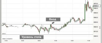
Example of TA on the stock exchange
This is an hourly chart for Sberbank shares. From the point of view of technical analysis, this stock instrument shows both different technical figures and a change in the direction of a stable trend after the formation of a double top. Thanks to the MACD technical indicator, divergence is clearly visible. Surely, attentive investors also noticed that the stochastic showed technical zones of overheating before most corrective movements.